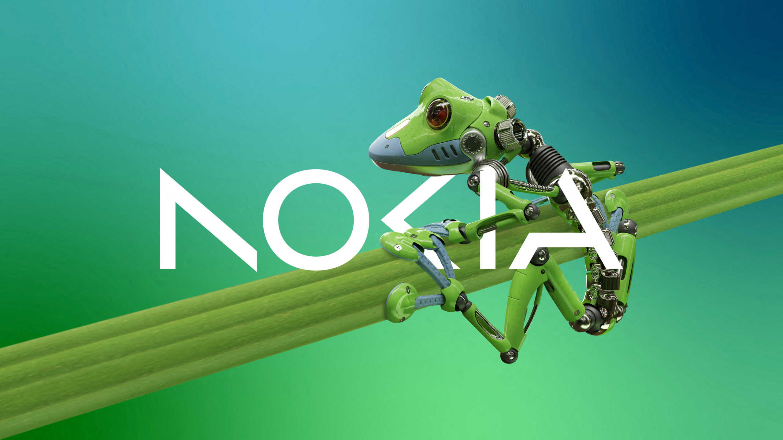
In an effort to present itself as a tech brand that includes more than just mobile devices, Nokia has updated its logo with a streamlined, angular design.
The new Nokia logo was designed in collaboration with the consulting firm Lippincott, as part of a broader strategy for the company to express itself “as a leading B2B innovation leader, recognizing the potential of digital in every industry sector”.
The previous logo design, created in 1979, has been streamlined to be simpler and more angular with slimmer letters. Nokia’s signature dark blue color just got brighter. The diagonal lines of the “K” in the previous arrow-shaped logo were retained in the new logo, but the letter’s upright stem was removed. Removed from the letters “N” and “A” for a modern, weathered look. The shape of the letter “O” has changed from a circular square in the old logo to a circular shape in the new logo.
“Designed as a symbol of collaboration, it is critical for Nokia to realize the rapidly growing potential of networks, unlocking gains in sustainability, productivity and accessibility,” the company said.
With information from APE-MPE

“Total alcohol fanatic. Coffee junkie. Amateur twitter evangelist. Wannabe zombie enthusiast.”


More Stories
The new series from the Sandman universe has been released on Netflix
Steam closes a loophole that allows players to get their money back
After 14 years, Apple will do the unheard of on iPads