Google Maps has been around for many years as one of the best navigation tools for mobile phones and beyond, although it's not the best at mapping areas. But Google continues to support it with regular aesthetic improvements to keep Maps up to date and not looking out of place in the latest versions of Android. Recent improvements have added weather information for the area of interest, new colors for areas covered in water, and green areas, reminiscent of iOS. Now, it appears that Google is preparing to change the layout of navigation options in Maps, a move that may make the user interface easier to understand and use.
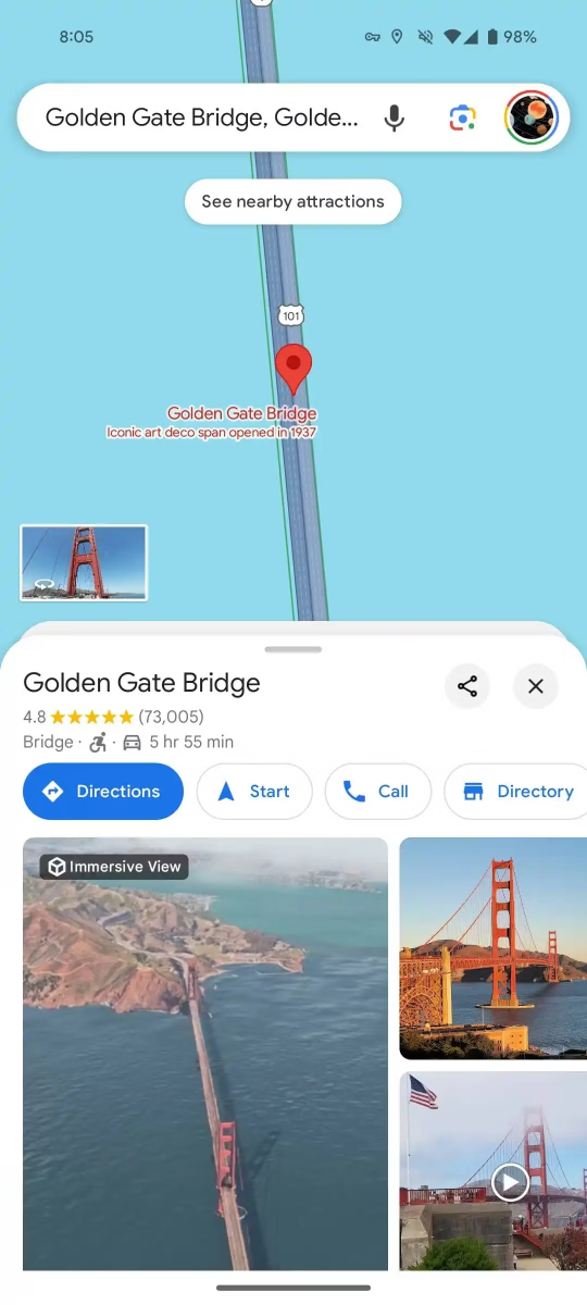
The navigation user interface appears from the moment the user selects the destination. First, simply tap a location marker on the map to bring up a card in the bottom half, with quick navigation options, and the ability to search for photos, ratings, and accessibility information. The user can expand the card to cover the entire screen to read reviews and see more information about the site. Cases in which the app's appearance has changed for users of Maps version 11.113 have already begun to be reported.
Although the application in its new form is not yet available to everyone, the changes seem small but certainly noticeable. For example, Maps now has rounded corners on the bottom card, which appear when the user points to a point. The card also features publishing site icons and an option to close without the familiar scroll down. We've all accidentally moved to other areas of the map while trying to close the card with additional information. Cards of various cities and attractions also have the same icons and rounded corners. In addition, the enlarged version of the card no longer takes up the entire screen.
Another nice, modern touch is captured in the navigation UI, which now appears when the user selects a destination and presses the directions button. The origin and destination are displayed in a floating window, with rounded corners, instead of the square header found in the current design. Meanwhile, there is also an option to change the mode of transportation at the bottom of the card, instead of using the icons at the bottom of the destination search window. The new design looks more natural, with the estimated arrival time displayed directly below the selected mode of transport on the information card.
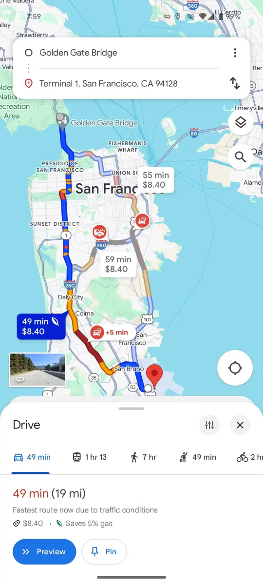
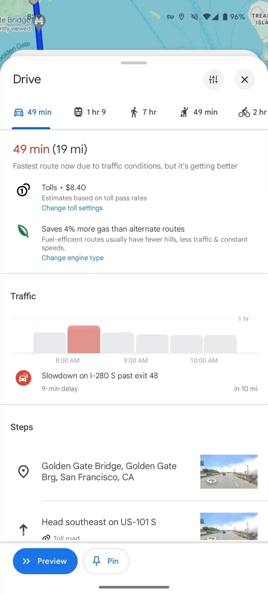
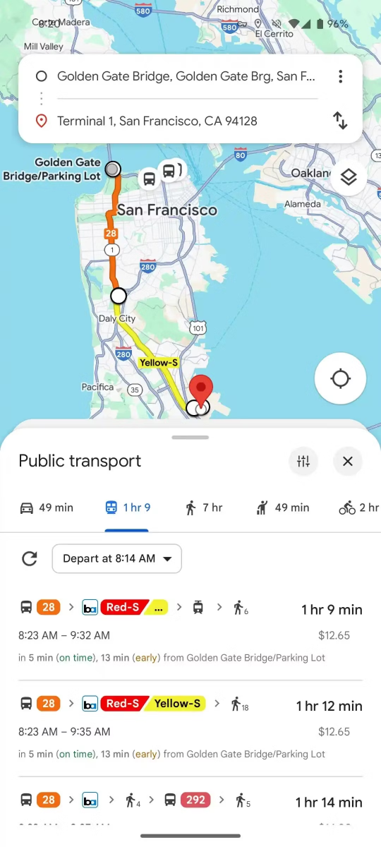
The bottom card is zoomable, but it no longer takes up the entire screen. Here, the user has easy access to ongoing navigation instructions and other useful information, such as estimated traffic congestion points, while the overall design inside the card remains the same.
The general feeling is that Google could update the app further, before releasing it widely for Android devices or the corresponding app for iOS. In the meantime, anyone interested can try their luck updating the app or try restarting it to see if they will be among the people who see the new changes.

“Avid problem solver. Extreme social media junkie. Beer buff. Coffee guru. Internet geek. Travel ninja.”


More Stories
Fashion United: Five perfect (and affordable) fashion collaborations that just launched
New accessibility features for iPhone and iPad announced by Apple – Apple
Rumor: Xbox Game Pass price hike is coming